

Role
Sole designer
UX Research, Product Design, Interaction Design, User Interviews
Timeline
August 2025 - Present
Team
1 Product Manager
1 Engineer
What is Pencil Spaces?
Pencil Spaces is a startup building an all-in-one workspace for education, combining virtual classrooms and administrative tools into a single platform. With the team, we've achieved on average of 10,000+ DAU.

Whiteboard

Video Calling

Scheduling and Analytics
My Role
I joined Pencil Spaces in January 2025 as the sole product designer. The scope of my role is ever-changing as I lead the design direction of the product system, building out screens, and working with the engineering team, as well as being responsible for the branding and marketing needs for the startup
Problem
It takes a while to get people to understand Pencil Spaces
Pencil Spaces suffered from experience rot. It happens when new features get added in ad-hoc, outside the vision of the initial road map. With all the workflows and features that Pencil Spaces strived to have, a lot of features end up being shipped quickly as customer needs come in. This created a lot of confusion for first time users, and simple things like changing which device I want to use as a mic became complicated.
Solution
Redesigning the Virtual Classroom
Improving bottom bar navigation
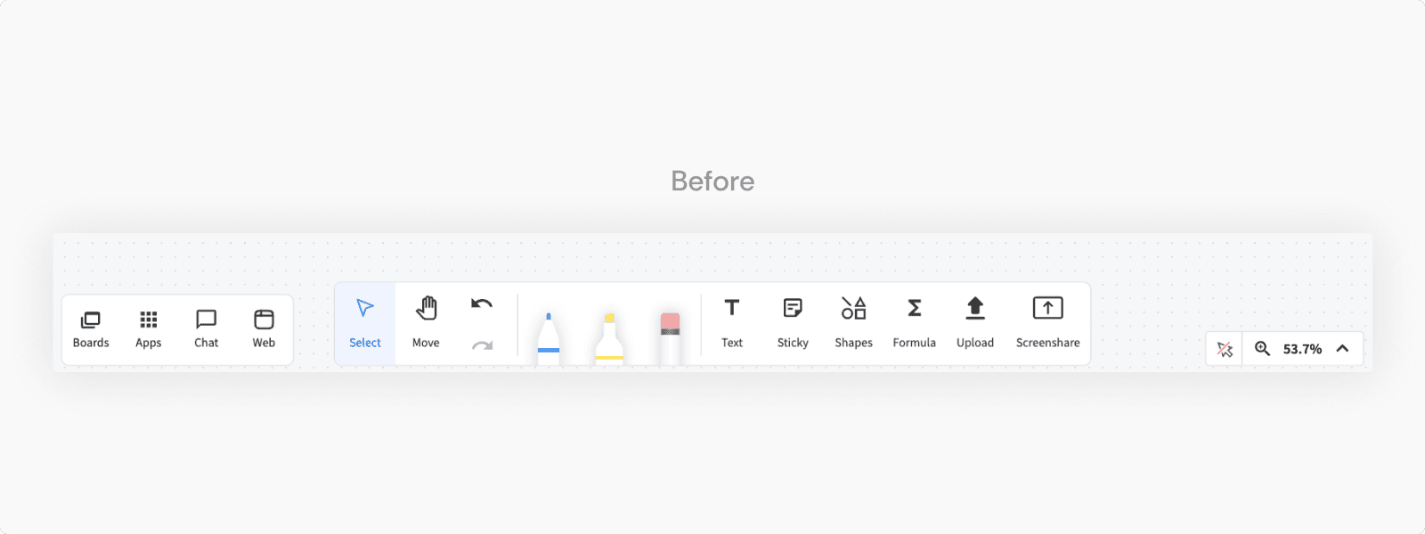
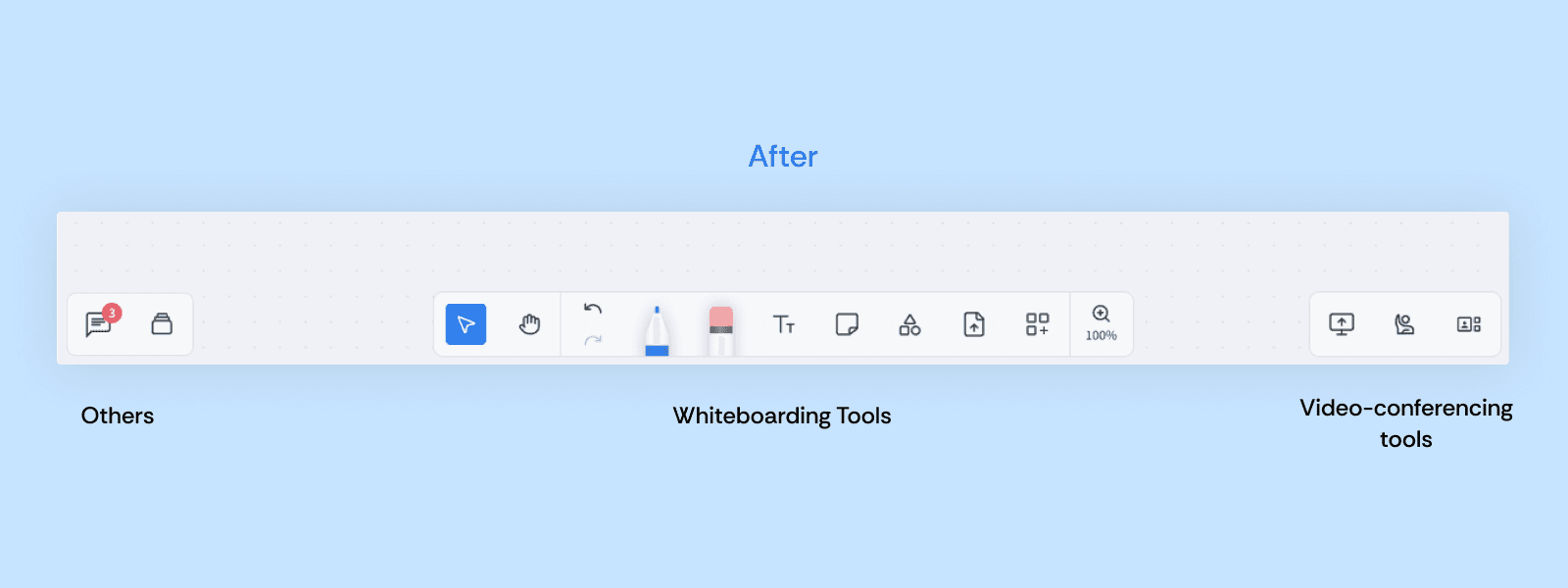
Simplifying whiteboard tools
Improved navigation for call controls
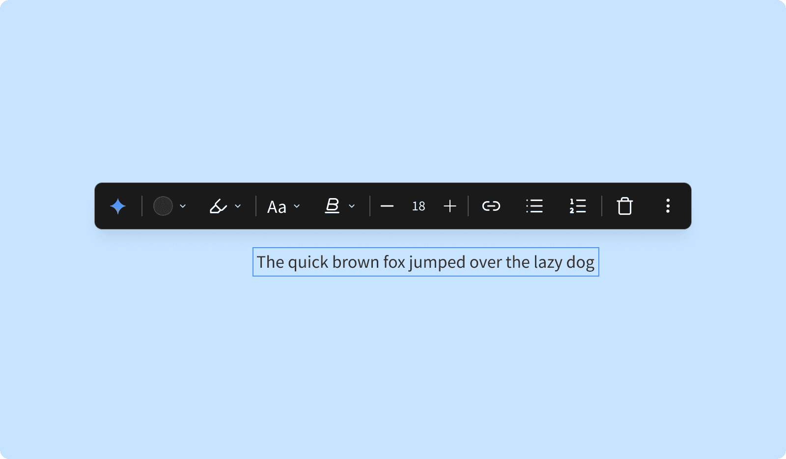
Object context menus
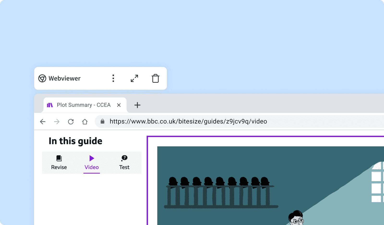
Apps context menus
Updating the mobile and tablet experience
Impact
⭐️ Built a new design system paradigm
While parts of the work is still in development, we've received overwhelming positive feedback from current users with the updates.
Early positive feedback from existing users.
Directly supported the closing of 3 major partnership deals
Enabled multiple product optimization workstreams that were previously blocked by legacy systems.
This case study is still under construction 🚧